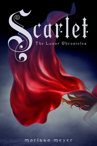
A while back, I did a cover compare for Cinder by Marissa Meyer
here. And since Scarlet's review will be going up tomorrow, I figured now was a great time to do a Cover Compare for Scarlet as well.
I love the US covers for this series. I think they're really distinctive and cool. I also like the Italian cover, although I don't know how fitting it is with the story, since I found Scarlet to be way too practical for such a long cloak. Is that just me? I also like the German cover. I'm a sucker for this style of cover and the little wolves! So cute. The Spanish cover creeps me out. She'd like a creepy doll! Actually, that's almost exactrly what I said about the Spanish cover of Cinder, although in that case I liked it. Probably because I couldn't see her face. And the Portuguese cover looks like ever other YA cover ever. Pretty but common and it doesn't really fit with the story in my opion either. What do you think? Which is your favourite?
 |
| US |
 |
| Spanish |
 |
| Italian |
 |
| Portuguese |
 |
| German |


Oh yes, that Spanish one is definitely creepy Megan! I don't like feeling like she's staring at me.... :) I think the Italian and German covers are my favorite, the German one because it's so graphic and different, and the Italian one because it's just pretty:) You're right that it doesn't entirely fit the story though. Love seeing all these different covers!
ReplyDeleteOhhh, the Spanish and the Portuguese covers are definitely my faves, although I like them all! Creepy is good, which is why the Spanish one caught my eye right away. At least it provokes some emotion.
ReplyDeleteMy favourite is the US and the Italian one coming in second. The Portuguese looks very similar to all YA with the dress and is boring. I like the cloak on the Spanish one but her face is creepy for sure.
ReplyDeleteI really like the US cover, since it captures the whole sphere of the book. BUT, I wouldn't mind getting the Spanish edition either. I don't picture Scarlet looking like that, but it has a nice eerie feeling to it :D The Italian cover is stunning! The Portugese one is really a mixture of Tiger Lily/US Scarlet cover to me. I like it! I'm not a fan of the German one. It's so boring.
ReplyDeleteOh wow I never even saw the other Scarlet covers! I think my fav is still the US one but I also love the Portuguese despite the unfortunate font choice. The Spanish one freaks me out she looks like a doll! (Dolls give me the heebie jeebies!)
ReplyDeleteWow, I actually like all of them. The Spanish one looks kind of Christmas-y to me though. And the Portuguese looks too ... contemporary. But still all beautiful.
ReplyDeleteI've never actually seen any of the other covers for Scarlet until now, but there are all pretty awesome! The Spanish one does creep me out a little though, but I think the Portuguese one is my favourite actually! I haven't read the book yet, so I'm basing it more on how pretty I think it is! haha The only thing I think would be better is if it were a red cloak instead of a red dress....because even not having read this one, I know it's inspired by Little Red Riding Hood...so a cloak would've been much more fitting! But, like I said, I really like all of them. I love how each cover kind of says something a little bit different, yet they all kind of share a few similarities, too. :)
ReplyDeleteThanks for sharing, Megan! :D
Ooh ... I love the Italian cover! Very spooky looking. :)
ReplyDeleteI have to say, I love the Italian one although I agree--doesn't really fit the book! More Fantasy than Dystopian, BUT LOVE IT
ReplyDeleteI really like the American covers for this one but the Italian one is really pretty too!
ReplyDeleteI love that red is prominent in all of them! I think the Italian cover is my favorite though :)
ReplyDeleteI have not read Scarlet yet (been on my list forever, but I am hoping to get to it soon). I loved seeing all the different covers! They are so beautiful. The only one I am not that big of a fan of is the German one. Thanks for sharing!
ReplyDelete~Jess
There is one and only thing one can say to any performing celeb after a show, and that is "Sublime." Later, beyond any doubt, you can discuss things that could be improved next time around.
ReplyDeletecelebrities died 2014