
Wow, this one has been translated a boat-load of times. Some are lovely (Hebrew anyone?), some are ugly (sorry Dutch) some look like every other YA book ever (Lithuanian and Spanish) and some are just bizarre (the strangle childlike Indonesian cover). Overall, I think my favourite is the Hebrew. I do like the US cover, not neccessarily for the cover, but for the way it looks on my shelf. I can pick it out immediately when I glance over due to it's beautiful bright blue spine. Which is your favourite?
 |
| US |
 |
| German |
 |
| Portuguese |
 |
| Italian |
 |
| Dutch |
 |
| Indonesian |
 |
| Spanish |
 |
| Finnish |
 |
| Danish |
 |
| Polish |
 |
| Norwegian |
 |
| Lithuanian |
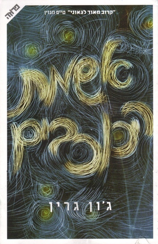 |
| Hebrew |
 |
| Chinese |
I kind of like the Hebrew one too, but also the Chinese and Danish. I had no idea there were so many covers for this lol.
ReplyDeleteSo many covers! I think I like the Italian one the best ... nothing like a hand full of stars. :)
ReplyDeleteI love the German one. I love the font and the simplicity, and the outline of the stars. It's really cool to see the different interpretations though. I think the strength of the US cover is that it just stands out in my head a lot because the blue is very distinctive.
ReplyDelete-P.E. @ The Sirenic Codex
AHAHAHAH *CRIES* THIS BOOOOOK
ReplyDeleteI love the German cover! My favorite is probably tied between that and the U.S one. That's so cool that there's so many different covers :)
ReplyDeleteHoly crap. There are a lot of different covers for this one. I am curious about what the movie tie in one will look like. I think I like the second one the best.
ReplyDeleteI definitely like the US one the best. I like the coloring and the overall look. I tend to like the covers from other countries more, but not in this case.
ReplyDelete