 |
| English version 1 |
 |
| English version 2 |
 |
| English Movie-Tie |
 |
| English Large Print |
 |
| English Deluxe Signed Edition |
 |
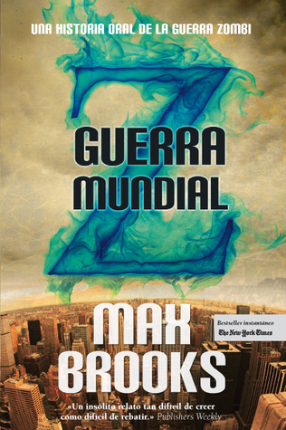
| Spanish |
 |
| Italian |
 |
| French Version 1 |
 |
| French Collector's Edition |
 |
| French Version 2 |
 |
| Portuguese |
 |
| Bulgarian |
 |
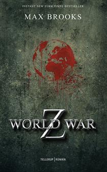
| Swedish |
 |
| Norwegian |
 |
| Romanian |
 |
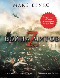
| Russian Version 1 |
 |
| Russian Version 2 |
 |
| Slovak |
 |
| Danish |
 |
| Polish |
 |
| Thai |
 |
| Turkish |
 |
| German |
 |
| Hebrew |
There's a lot! Most of them are fairly text-based, which I like. I'm partial to the English Version 1 because that's the one I have (and got signed by Max Brooks). My other favourite is the Portuguese cover. There are three that stand out as being the worst by far for me. The Russian Version 1 looks soooo cheesy and bad. I would never buy this amazing book based on that cover. I also don't like the Thai cover. The pink is weird and the zombies look like demon monkeys. But the Italian cover. What is going on here?!?! I discussed it with the boyfriend, who is a huge Max Brooks fan, and we determined they look like aliens from a hoax video. Who are holding each other's lobster claws.
What do you think? Which is your favourite? Are you a fan of such text-based covers?

Woha I'm surprised how scary some of them are. I like the second one the best. Also I'm surprised it's not translated into Serbian yet. Maybe it'll be soon. Great post :)
ReplyDeleteHigh carumba! I'm used to seeing a couple of different covers for a title, but this is insane, I don't even know where to start, or how to pick a favourite. I like the Turkish one, but the Danish version is pretty sick too.
ReplyDeleteCarmel @ Rabid Reads
Wow so many covers! I think I like the English movie tie in and the Spanish covers best.
ReplyDelete