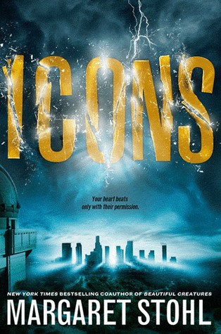
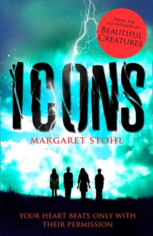
This week's Cover Compare looks at Icons, but Margaret Stohl (review coming on Thursday). You guys, this time I actually can't decide which cover I prefer! The US and UK covers are pretty similar, but I can't really give one an edge over the other. I like the lighting of the US one, but I like that you can see the characters on the UK versions. Which do you prefer?
 |
| US cover |
 |
| UK cover |


I think I prefer the US cover. I like the font of the title and the coloring. But what I like about the UK cover is the inclusion of "your heart beats only with their permission"
ReplyDeleteMel@thedailyprophecy.
I like the color of the UK cover its the one that catches my eye first but it is a hard decision
ReplyDelete