
Curse Workers by Holly Black:


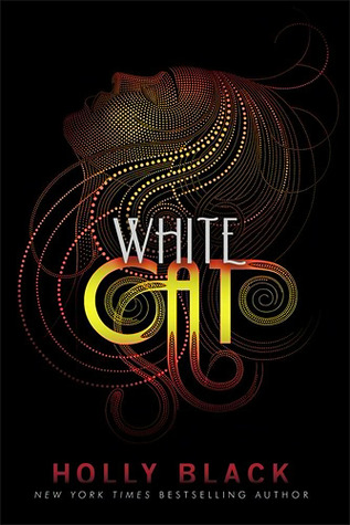
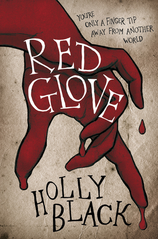
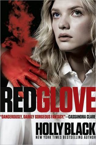


The only book I own in this series is Red Glove and I have the cover on the left, which is actually my least favourite. Unfortunately for me, even though the matching Black Heart cover is on Goodreads, I can't find it anywhere, so I doubt I'll be able to get a matching series for this one. The middle set is my favourite, but I actually really like the right covers of Red Glove and Black Heart, but I don't like White Cat.
Delirium by Lauren Oliver

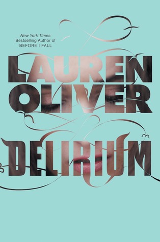

I own this one and I have the right version, which is my favourite. Too bad they switched to the middle one. I also think it totally bizarre how the girl in the middle one and the girl in the right one look nothing alike. I haven't read it yet so I can't comment on which matches the book.
Born Wicked by Jessica Spotswood


I definitely prefer the left cover for this one. It's so much more eye-catching. Although it does look as though it could be sort of erotic-y, since her skirt is kind of short and she's lying down. But I like it! There's nothing wrong with the right cover, but it just lacks the magic of the left one.
I like the original White Cat covers because they're the ones I'm used to and the others don't feel right. BUT, I remember being like ICK when I first saw them so I understand the change haha.
ReplyDeleteThe new Born Wicked cover is soooo much better! (Which I believe is the left one) I like the one you like too! It's so pretty. I like the far right ones for the Holly Black Novels! And the first one for Delirium, I really wish they stuck with that one and didn't move to the middle one. Thanks for sharing Megan!
ReplyDeleteI really dislike people or people's faces on my books - I much prefer abstract covers. So therefore, I actually like the left Delirium cover the best :) But I agree, it drives me crazy when they change the whole look of the covers part way through a series release! It's so annoying when you already own part of the series in a particular cover format. Especially when they re-do the whole series in a cover you like better. Makes me want to re-purchase the books. Even worse is when you already have one of the books autographed in a cover you don't particularly like ;p
ReplyDeleteI hate how they constantly change covers. Like with the Jackson Pearce fairytale series. They just changed the covers halfway through. Not cool. It's really neat seeing all the different covers! I'm also a big fan of the middle set of covers for the Curse Workers series. I just bought White Cat and Red Glove with those covers. :D
ReplyDeleteI think my favourite White Cat covers are the ones on the left! For some reason, the other two just don't cut it for me. And I do love the old Born Wicked cover ... the new one's nice and all, but I just love the colours of the first one better. Oh, and Delirium! I actually really like the middle covers!
ReplyDeleteGreat choices. :)
I love this little post, it's interesting to see how the covers vary. I have the cover on the left for Delirium, and it's probably my favourite since the others are creepy with the faces and all, haha. Awesome post! :)
ReplyDeleteThis is a massive pet peeve of mine. I also liek to have either all hardcover / paperbacks and sometimes I will break that pattern to have matching covers (depending on which covers I like better). My set of The Curse Workers is different for every book. Drives me crazy!!
ReplyDelete